
📌 3줄 요약
· 사진 보존과 일러스트 분할
· 3:4 세로 포스터 구성
· 여백 중심의 편집 디자인
사진 한 장이 두 장면 포스터가 되는 구조
이 AI 사진 변환 프롬프트의 핵심은 한 장의 사진을 한 화면에 그대로 넣는 것이
아니라, 위와 아래를 서로 다른 방식으로 보여주는 데 있어요.
위쪽 절반은 원본 사진을 최대한 보존하고, 아래쪽 절반은 같은
장면을 작은 손그림으로 다시 표현합니다.
이미지 결과를 보면 위쪽에는 비가 오는 날
촬영한 인물 사진과 건물의 돔, 첨탑, 아치가 그대로 남아 있어요. 노란 우비를
입은 인물과 검은 우비를 입은 인물의 표정도 사진의 분위기를 유지하고 있습니다.
아래쪽에는 같은 두 사람과 건물의 형태가 단순한 그림으로 작게 배치되어 장면을 이어가고요.
이렇게 나누면 한 장의 사진에서 기록성과 해석을 동시에 보여줄 수 있어요. 사진만
크게 보여주는 결과보다 포스터나 독립 출판물 같은 인상이 강해지고, 아래쪽의 넓은 빈
공간 덕분에 시선이 복잡하게 흩어지지 않습니다.
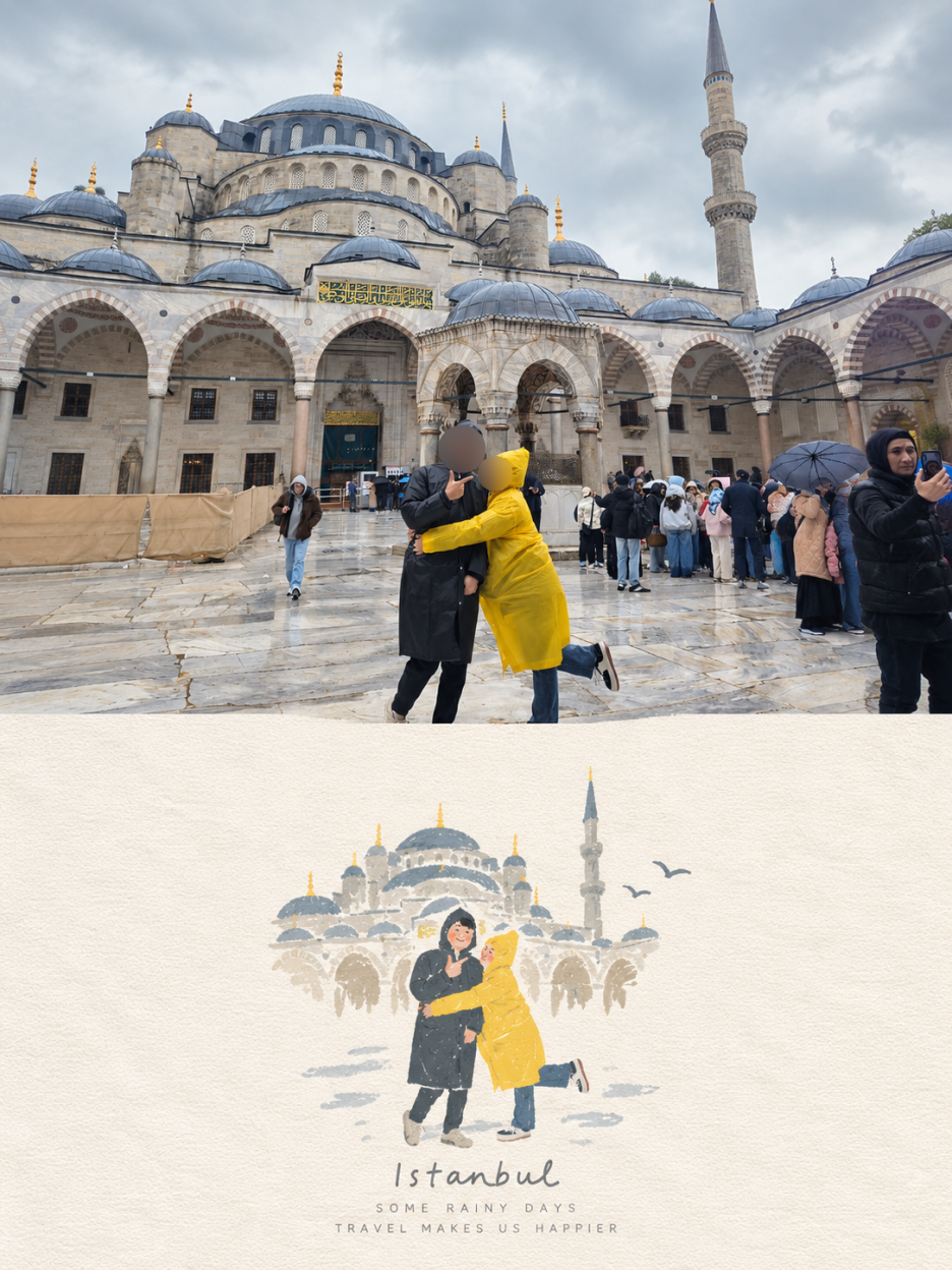
비 오는 여행지의 건축물과 인물이 함께 보이는 사진이라 위아래 장면의 연결이 비교적 분명하게 드러납니다.
사진의 분위기와 인물의 위치를 먼저 확인하면 변환 결과를 비교하기도 편해요.
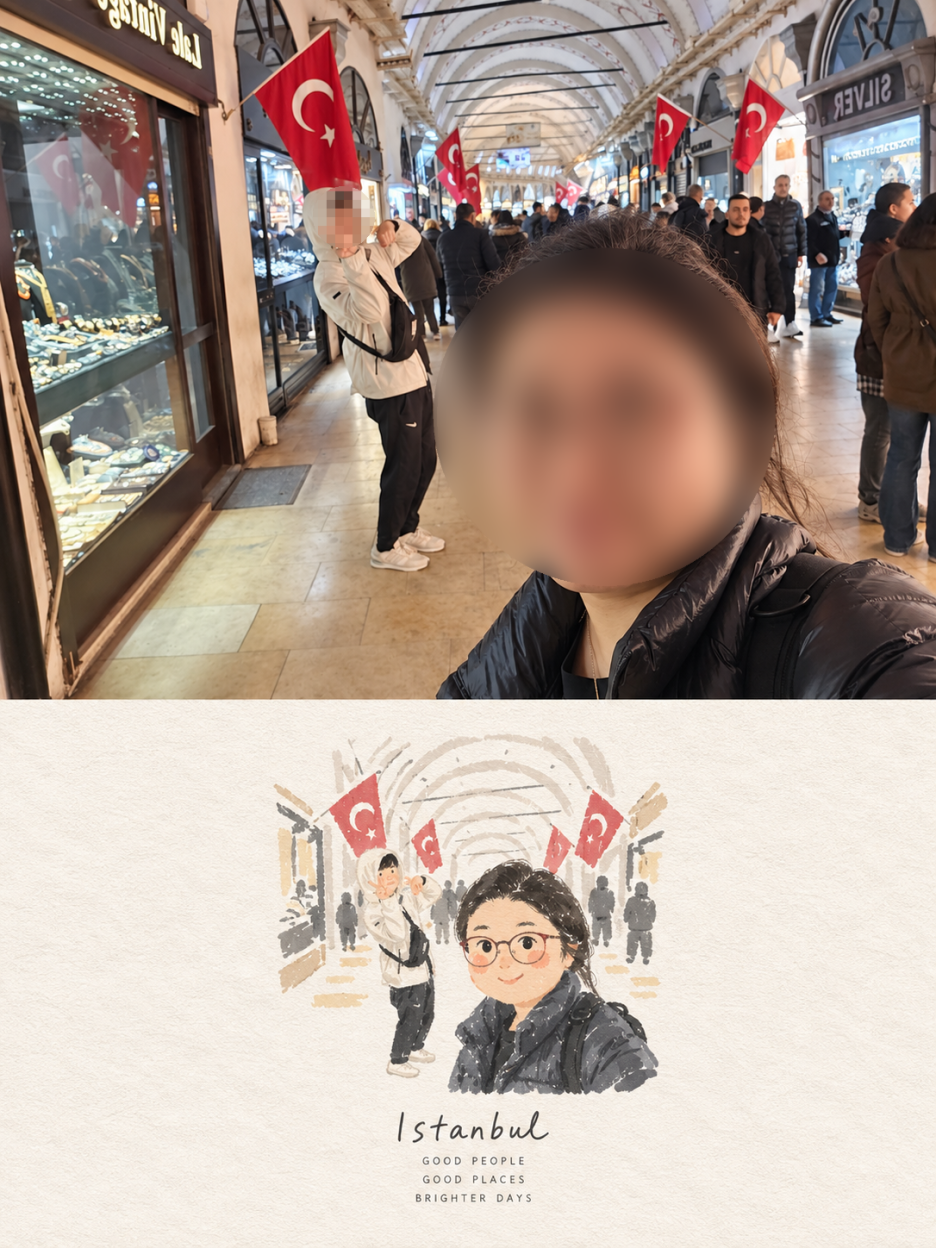
프롬프트를 넣을 때는 여러 사진을 한 번에 콜라주로 합치지 말라는 조건을 먼저 이해해야 합니다.
업로드한 사진마다 독립된 포스터를 하나씩 만들라는 뜻이기 때문이에요. 사진 두 장을 한 화면에 섞고 싶다면 이 프롬프트의
목적과 달라질 수 있습니다.
원본 보존 지시가 결과를 좌우해요
AI 사진 변환 프롬프트에서 가장 먼저 확인할 부분은 원본 사진을 얼마나 바꾸지 말라고 했는지예요.
주인공의 얼굴, 체형, 자세, 표정, 옷과 주변 사물의 위치를 유지하라고 구체적으로 적어야 사진의 정체성이
흐려지는 일을 줄일 수 있습니다.
이번 결과의 위쪽 사진은 원본의 구도와 인물이 이어집니다.
건물 앞에서 우비를 입고 찍은 인물 사진이라는 점이 남아 있고, 배경의 돔과 첨탑도 알아볼 수 있어요.
하늘과 주변 배경은 세로 포스터에 맞도록 자연스럽게 넓어졌지만, 인물 자체가 길게 늘어나거나 다른 사람으로 바뀐 모습은 보이지 않습니다.
여기서 중요한 표현은 사진을 더 화려하게 꾸며달라는 말보다 필요한 경우에만 배경을 확장하라는 조건입니다.
하늘이나 벽처럼 주변 환경을 늘릴 수는 있지만, 주요 대상을 늘리거나 찌그러뜨리거나 교체하지 말라고 선을
그어야 해요. 이 구분이 없으면 세로 비율에 맞추는 과정에서 얼굴이나 몸의 비율이 달라질 수 있습니다.
프롬프트 전문, 복사해서 그대로 쓰세요
이 프롬프트는 설명을 참고해 중간 문장을 다시 조립하는 방식보다 원문 전체를 그대로 사용하는 편이 의도에 더 잘 맞습니다.
사진을 한 장씩 처리하라는 조건부터 위쪽 원본 보존, 아래쪽 손그림, 색상과 여백, 타이포그래피, 피해야 할 표현까지 순서가 이어져요.
Create one independent high-end editorial poster for each uploaded photo. Do not combine multiple photos into a collage. Each photo must be processed and output as a separate poster.

OVERALL FORMAT

Strict 3:4 vertical composition.

Divide the canvas horizontally into two exactly equal sections, with a precise 1:1 height ratio.

The top half occupies exactly 50% of the canvas.

The bottom half occupies exactly 50% of the canvas.

The two sections should feel visually connected as one refined art publication cover.

TOP HALF — ORIGINAL PHOTOGRAPH

Preserve the original photograph as faithfully as possible.

Keep the main composition, subjects, identity, facial features, body proportions, poses, expressions, clothing, objects, and spatial relationships unchanged.

Preserve the realistic photographic texture, natural lighting, shadows, atmosphere, and original color mood.

Apply only subtle, sophisticated editorial color grading, creating the feeling of a premium magazine photograph, contemporary art book, or high-end independent publication.

The image should remain photorealistic and authentic, never overly retouched or artificially stylized.

If necessary to fit the 3:4 composition naturally, extend the sky, ground, walls, or surrounding environmental background.

Background extension must feel seamless and photographic.

Never stretch, distort, reshape, replace, or alter the main subject.

BOTTOM HALF — MINIMAL HAND-DRAWN PAPER ILLUSTRATION

Extract the most recognizable visual elements from the original photograph and reinterpret them as a minimalist hand-drawn paper-cover illustration.

Preserve:

The most recognizable subject

Essential silhouette and proportions

Key pose or gesture

Important objects

The core narrative relationship between people and objects

Highly simplify the image. Remove unnecessary details and retain only the visual information needed for immediate recognition.

Use:

Delicate, slightly imperfect hand-drawn lines

A small number of bold, clearly defined acrylic-style flat color shapes

Rough paper texture

Visible handmade brush marks

Slightly irregular, organic edges

Subtle imperfections that make it feel genuinely handmade

The main illustrated subject should be small, centered, and carefully composed, occupying approximately 10–20% of the bottom half.

Leave a large amount of negative space around the illustration.

The background should primarily resemble:

Rough white paper

Warm off-white paper

Pale natural paper

Minimal editorial book-cover stock

Use only a few lines or small color shapes to suggest the surrounding environment.

COLOR PALETTE

Extract the dominant colors directly from the original photograph.

Compress the palette into no more than 4 main colors.

Keep the colors restrained, sophisticated, and harmonious.

Use bold but controlled flat color blocks.

Avoid excessive color variation.

Preserve subtle paper grain and handmade brush texture.

The illustration should visually feel like a simplified color interpretation of the photograph.

TYPOGRAPHY

A small amount of simple typography may be included when appropriate.

Possible elements:

A short title

Keyword

Object name

Location

Year

Number

Short phrase

Text should be minimal, understated, and editorial.

Typography should naturally interact with the large areas of negative space and the small illustration, evoking:

Art book covers

Independent publishing

Contemporary editorial design

Thoughtful children's picture books

Do not force text into the composition if it does not naturally fit the photograph.

VISUAL LANGUAGE

The final poster should feel:

Quiet · Poetic · Refined · Minimal · Innocent · Relaxed · Artistic · Thoughtful · High-recognition · Premium

The visual concept should be:

“A small subject surrounded by a large amount of empty space.”

The result should resemble a carefully designed independent art publication cover, rather than a commercial advertisement.

AVOID

Do not use:

Colored-pencil aesthetics

Crayon textures

Bleeding watercolor

Pure line-art illustration

Complex realistic illustration

Heavy oil-painting effects

Smooth polished digital illustration

3D rendering

Glossy 3D textures

Commercial cartoon aesthetics

Cute commercial character design

E-commerce advertising aesthetics

Generic poster templates

Excessive decorative elements

Busy compositions

Excessive typography

FINAL ART DIRECTION

The top half should feel like a beautiful, authentic editorial photograph.

The bottom half should feel like a small, handmade visual poem derived from that photograph.

The two halves should clearly belong to the same visual story, while maintaining a strong contrast between photographic realism above and minimal handmade illustration below.

Prioritize recognition, restraint, negative space, material texture, subtle imperfection, editorial sophistication, and artistic storytelling over decorative complexity.
두 이미지를 비교하면 차이가 선명해요
|
구분
|
원본 사진
|
변환 결과
|
|
위쪽 구성
|
사진 전체 장면
|
3:4 포스터 상단
|
|
아래쪽 구성
|
없음
|
작은 손그림과 여백
|
|
인물 표현
|
실제 표정과 우비
|
단순화한 형태와 색 면
|
|
배경 표현
|
돔과 첨탑의 세부 묘사
|
알아보기 쉬운 실루엣
|
|
색감
|
비 오는 날의 자연스러운 톤
|
제한된 색상과 종이 질감
|
|
글자
|
없음
|
짧은 장소·날씨 문구
|
📌 자주 묻는 질문
Q. 사진 여러 장을 한 번에 넣어도 되나요?
프롬프트의 기본 방향은 사진마다 독립된 포스터를 만드는 것입니다.
여러 사진을 한 화면에 섞는 콜라주가 목적이라면 다른 지시문이 필요하고, 이번 구성에서는 사진을 한 장씩 처리하는 편이 맞습니다.
Q. 아래쪽 그림에 글자를 꼭 넣어야 하나요?
꼭 넣지 않아도 됩니다. 장소나 날씨처럼 사진을 보완하는 짧은 문구가 자연스럽게 어울릴 때만 사용하고, 빈 공간과 그림의 균형을 먼저 확인하는 편이 좋아요.
'🤖 AI PROMPT' 카테고리의 다른 글
| ChatGPT 이미지 변환 프롬프트 공유 | 유럽풍 동화책 수채화풍 이미지 변환 | 흐린 여행 사진이 감성 동화로 바뀌다 (0) | 2026.09.09 |
|---|---|
| 나만의 미니미 소장! 요즘 핫한 AI 피규어 제작 후기 & 방법 | 무료 프롬프트 공유 👍 (1) | 2026.09.04 |
| Gemini 이미지 생성 프롬프트 · 일반 사진을 유화그림 스타일로 변환하기 (0) | 2026.08.30 |